TOUCH! is an interactive system consisting of a smart ring and a Social Media App. The system is aim to help users establish heart-to-heart communications and stronger connections, and more intuitively present their complex feelings in unique ways by utilizing multiple sensations as channels of perceiving and expressing emotions.
During the Covid-19 pandemic, physical isolation led people to rely on social media for communication. However, our research found that the influx of textual messages caused information overload, often obscuring emotions. Thus, we decided to explore solutions to this issue as the starting point of the competition.
Then, we conducted semi-structured interviews with 10 participants to gain deeper insights into their social media roles, impactful interactive behaviors, and how they convey emotions.
After analyzing our interviews, we’ve gathered valuable insights into our potential user group. Next, we’ll delve deeper into the contexts, characteristics, and challenges of our primary target user group by organizing the information into two distinct personas.
Building on Insight 2 (individuals use diverse mediums to convey emotions), we explored two avenues: Developing a Social Media App and Investigating Wearable Devices for Seamless Integration. We conducted a literature review on multi-sensory wearables and a brief competitor analysis of major social media platforms to deepen our understanding.
After gaining a broader understanding of existing products and patents, we began conceptualizing the features and ideas for our product.
To generate a multitude of creative concepts, we conducted two rounds of Crazy 8 brainstorming sessions for both the social media app and wearable devices.
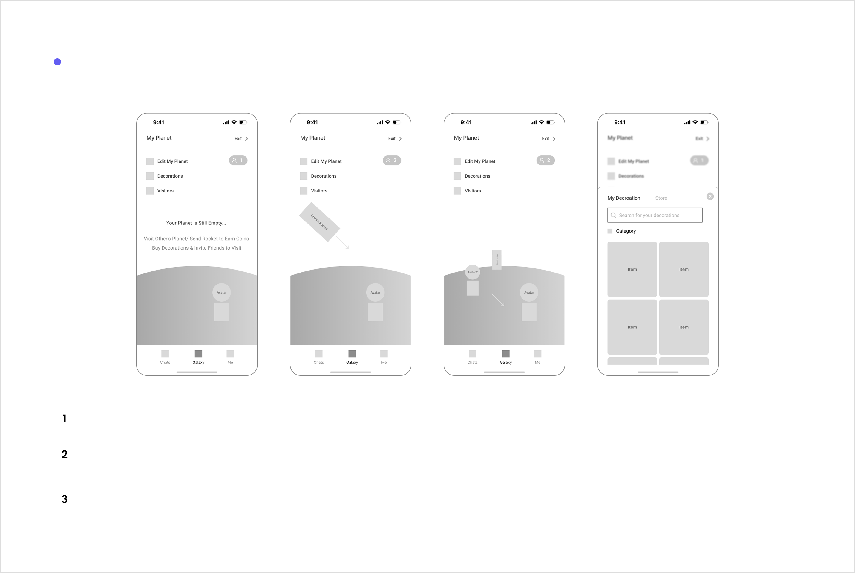
In our app design, we aim to incorporate metaphorical elements. By drawing parallels between the app's functionalities and familiar real-world concepts, we intend to create a more intuitive and engaging user experience, making interactions more meaningful and enjoyable.
Given that the majority of interactions occur within the app, we placed significant emphasis on its interactivity and usability. To evaluate this, we recruited five individuals with limited understanding of our product concept and had them perform specific tasks on our interfaces and study model without guidance.
During testing, confusion arose about the system's flow. Participants questioned how to prioritize when receiving SCENEs simultaneously from multiple senders and how the ring processes and displays multiple SCENEs from one person in a short timeframe. Therefore, our team had extensive discussions to address these issues and developed logical specifications to handle various scenarios systematically.
In designing the multi-sensory social media app and ring, I've learned that design involves not only creating something new but also refreshing our perspective on existing concepts to enhance them. I've also gained insights into technology's transformative impact on human connections. Integrating multiple senses into social media goes beyond streamlined communication; it fosters a deeper, more immersive connection, showcasing technology's potential to bridge the virtual and physical realms.
In taking on this project for the intensive competition, I gained insights into my own areas for improvement, specifically in handling time constraints. Although I've acquired basic knowledge in various design and research methods, the competition's rapid pace often prevented my team from thoroughly implementing these approaches due to strict time restrictions. Adhering to the Agile Development Process was a notable challenge, as none of us had prior experience with such swift development practices.
Moving forward, I recognize the need to enhance my time-management skills to better align with the demands of agile development processes.